Introduction
There are campaigns that speak. There are campaigns that shout. And then there are campaigns like this — ones that hold their breath and let the space do the talking.
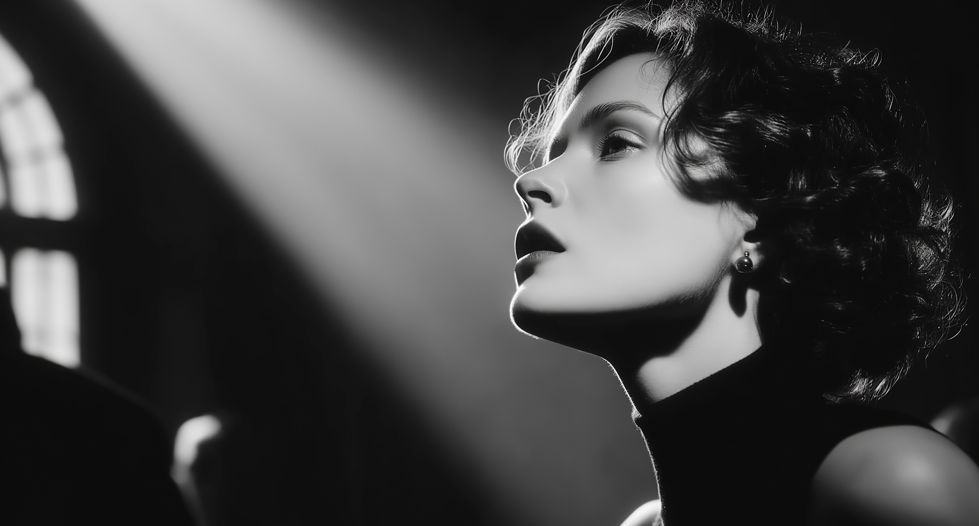
Architectural Silence wasn’t built on layers. It was built on subtraction. A collaboration with Proud’s Resort Collection, the campaign was a study in stillness — in using silence, tension, and modernist geometry to express elegance without decoration.
It wasn’t about being minimal. It was about being precise. Every image was a sentence. Every space between them, a pause. The absence became the message.

We designed the campaign like we were composing music — a structure of visual rhythm and restraint. The color palette was reduced to bone, fog, and charcoal. The motion: slow. The pace: deliberate. We traded performance for presence. Where other brands might animate, we let it breathe.
The architectural locations weren’t backdrops — they were characters. Each image was framed like a tension point. Nothing ornamental. Just line, light, and fabric. The result wasn’t just beautiful — it was inevitable.
“The luxury wasn’t in the visuals. It was in the space we left around them.”
— Isabella Chen, Strategy Lead
The challenge was creating something that resisted the urge to explain itself. The campaign didn’t say Proud — it let you feel it. That’s where the real elevation happens. Not through branding. Through discipline. Through restraint. Through removing everything that didn’t carry weight.
In a world addicted to visual overkill, this campaign was a calm blade. Still. Focused. And devastating in its control.
Conclusion
Architectural Silence reminded us that luxury doesn’t scream. It doesn’t decorate. It doesn’t dance. It just exists — immovable and unapologetically itself.
That’s what we built with Proud. Not a story. Not a statement. A presence. A silence. And a structure that will still be standing when the noise fades.